Hi, welcome to my portfolio!
RATNER companies
Corporate communication logos are usually boring but, I like to have fun with them.
the HC SOCIAL SQUAD
If you have 10,000+ stylists across the country that are social-media addicts it’s perfect to give them content to share with their friends.
That’s how the Social Squad got started.
They get rewarded for their efforts and the company has an organic way to communicate with clients and stylists. More importantly, it’s believable.
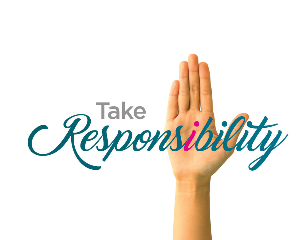
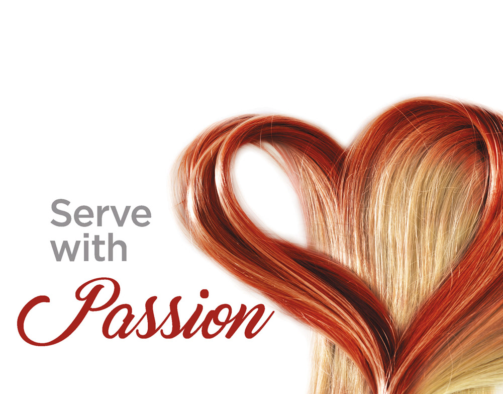
international WOMAN'S DAY
This is when people become the logo.
FORGE
The eternal symbol of commitment, a ring.
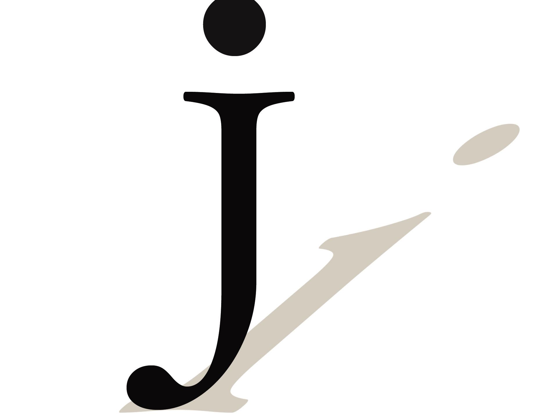
THE JOURNAL OF IMMUNOLOGY
Logos are pure design. Many thoughts in one visual. You can over design logos easily. That's why I like this logo design. Simplicity was the key to the message.
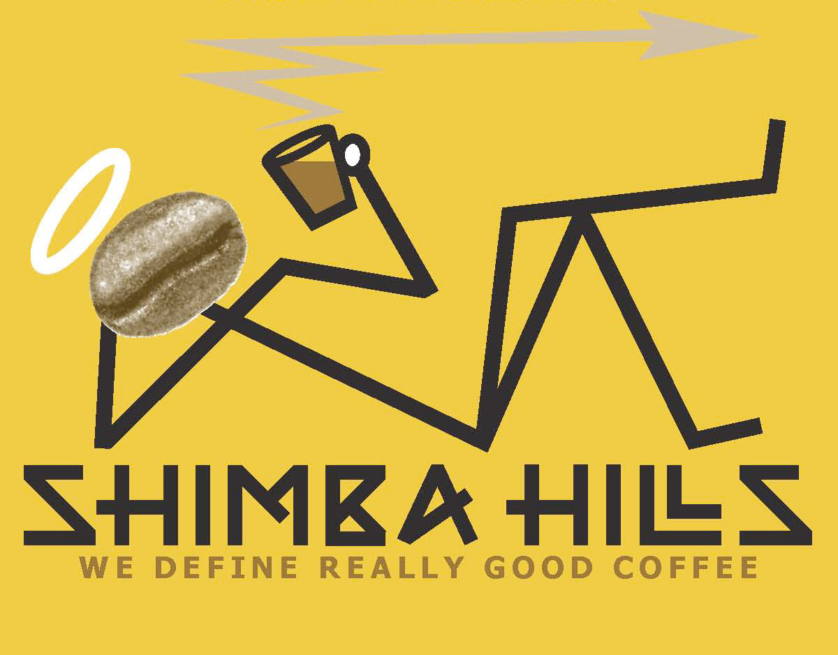
SHIMBA HILLS coffee
A small coffee company Shimba Hills, wanted to create a brand that gave back to the coffee growers. I took their passion for the industry and positioned them with the message "Good coffee, good causes, doesn't that taste better?"
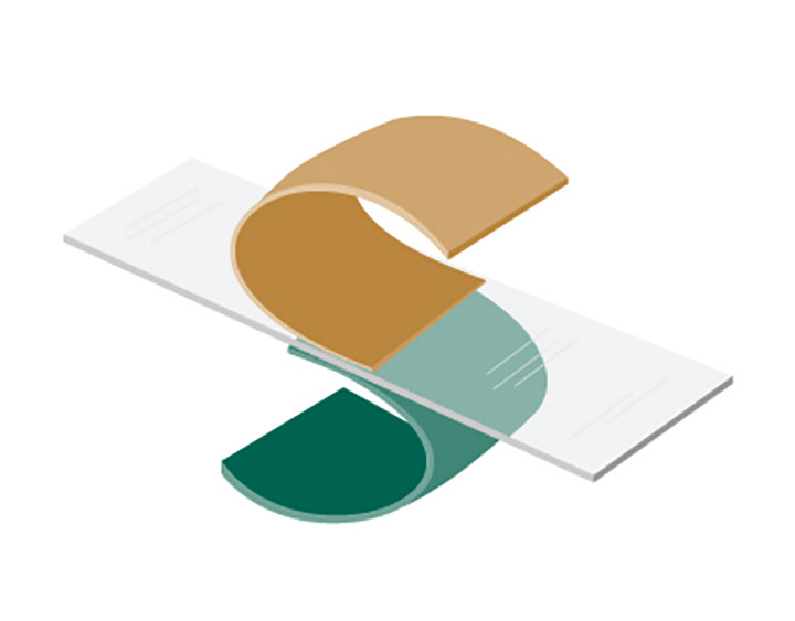
SQUIRES HIGHTECH
This fabric manufacturer had a unique process of laminating fabrics together to form higher performing materials.
I feel that the logo managed to communicate that unique part of their story.
(Note: the founder of this company also invented double knit fabrics - I tried not to hold that against him.)
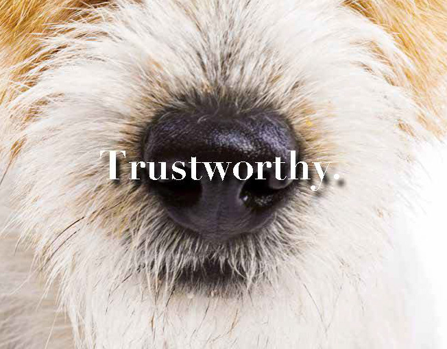
SPALDING Wealth Management
Sometimes you design a logo that's a real dog.

Ground Control
Targeted Marketing was the selling proposition for this advertising and design firm.
Mission, Vision & Values
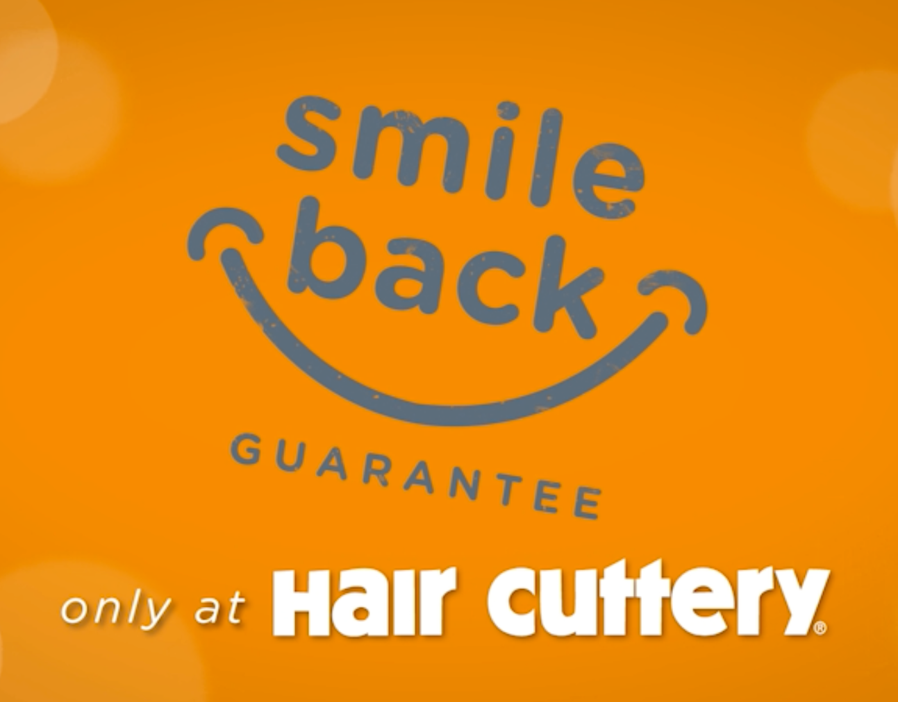
Smile Back Guarantee
Smiling back in the mirror at the stylist was confirmation of a service well done. That's the idea of the guarantee. if they're not smiling they're not going to come back. It worked well when animated in the television commercial (see advertising link for that).
GROUND ZERO creative
I named my company Ground Zero Creative as a reminder to always have a zero-based approach when marketing for my clients.
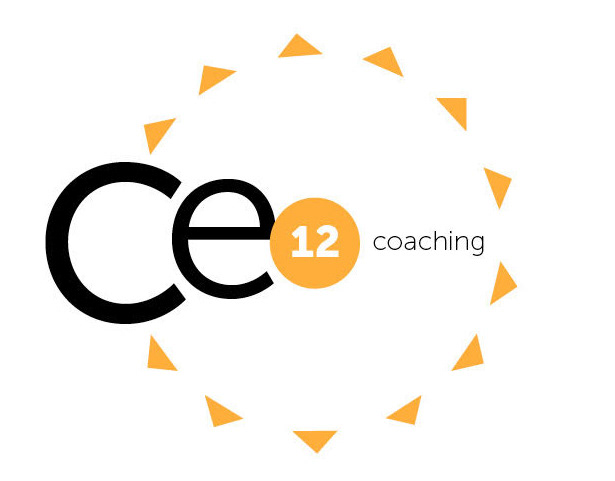
Ce12 COACHING
Renegade Communications
COMFORTEMP®
The original logo for COMFORTEMP was a four-color script design created by another agency. The problem was whenever a client used their product they were contractually obligated to embroider or print in four colors as part of their licensing agreement. The design actually hindered sales.
I created this logo approach and designed a personaized typeface to solve the issue.