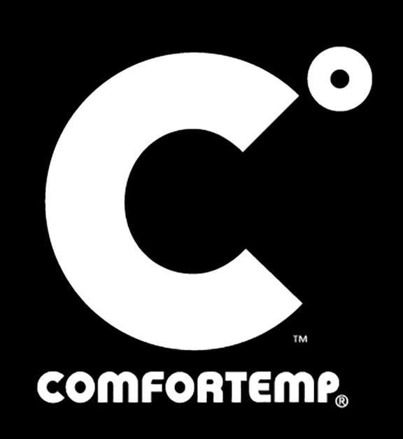
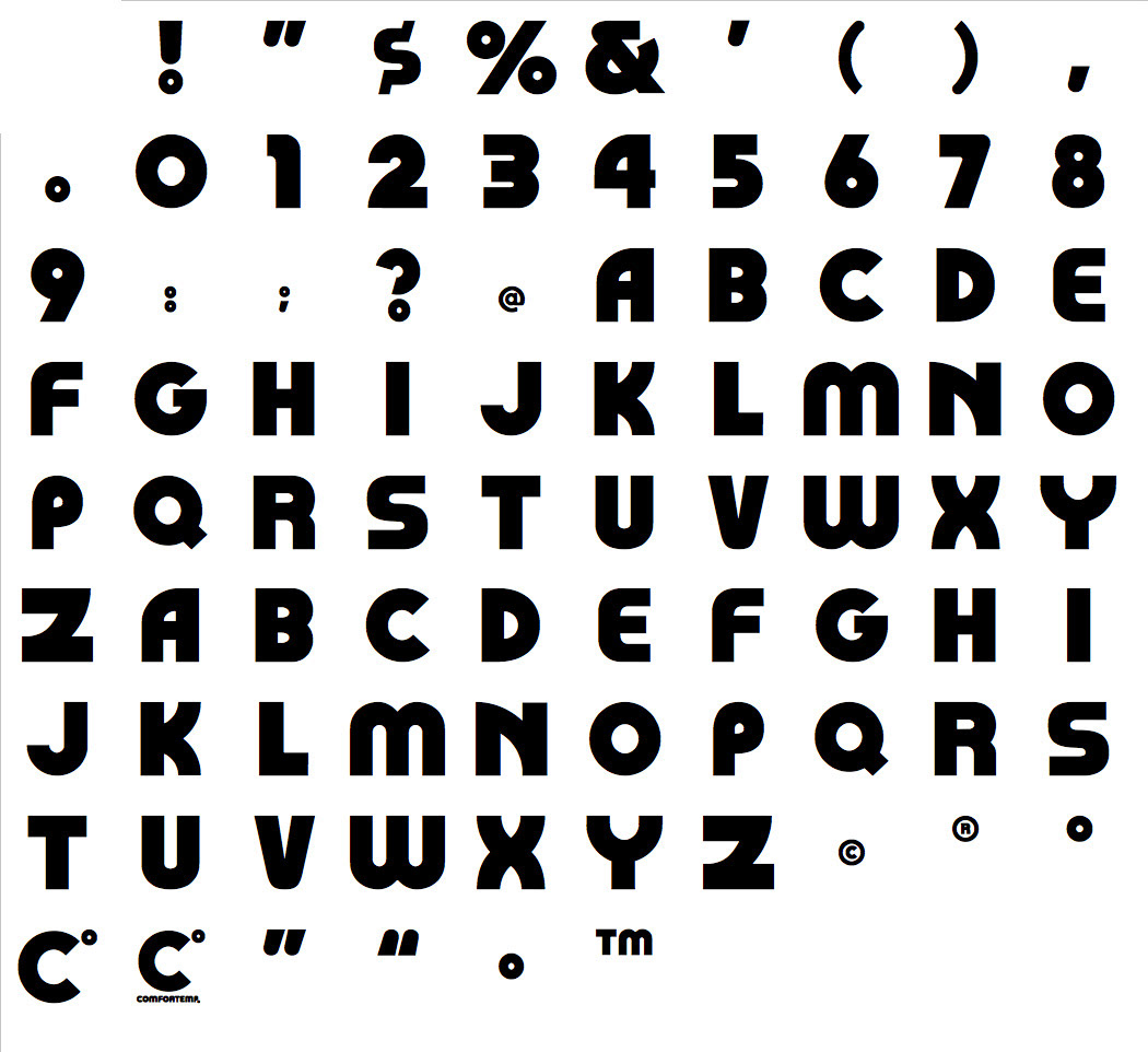
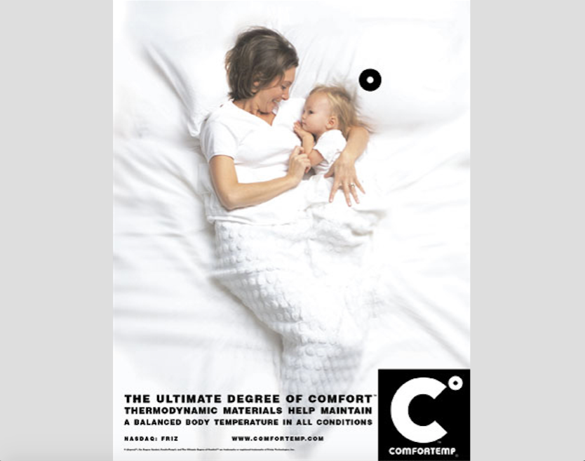
The original logo for COMFORTEMP was a four-color script design created by another agency. The problem was whenever a client used their product they were contractually obligated to embroider or print in four colors as part of their licensing agreement. The design actually hindered sales. I created this logo approach and designed a personaized typeface to solve the issue.