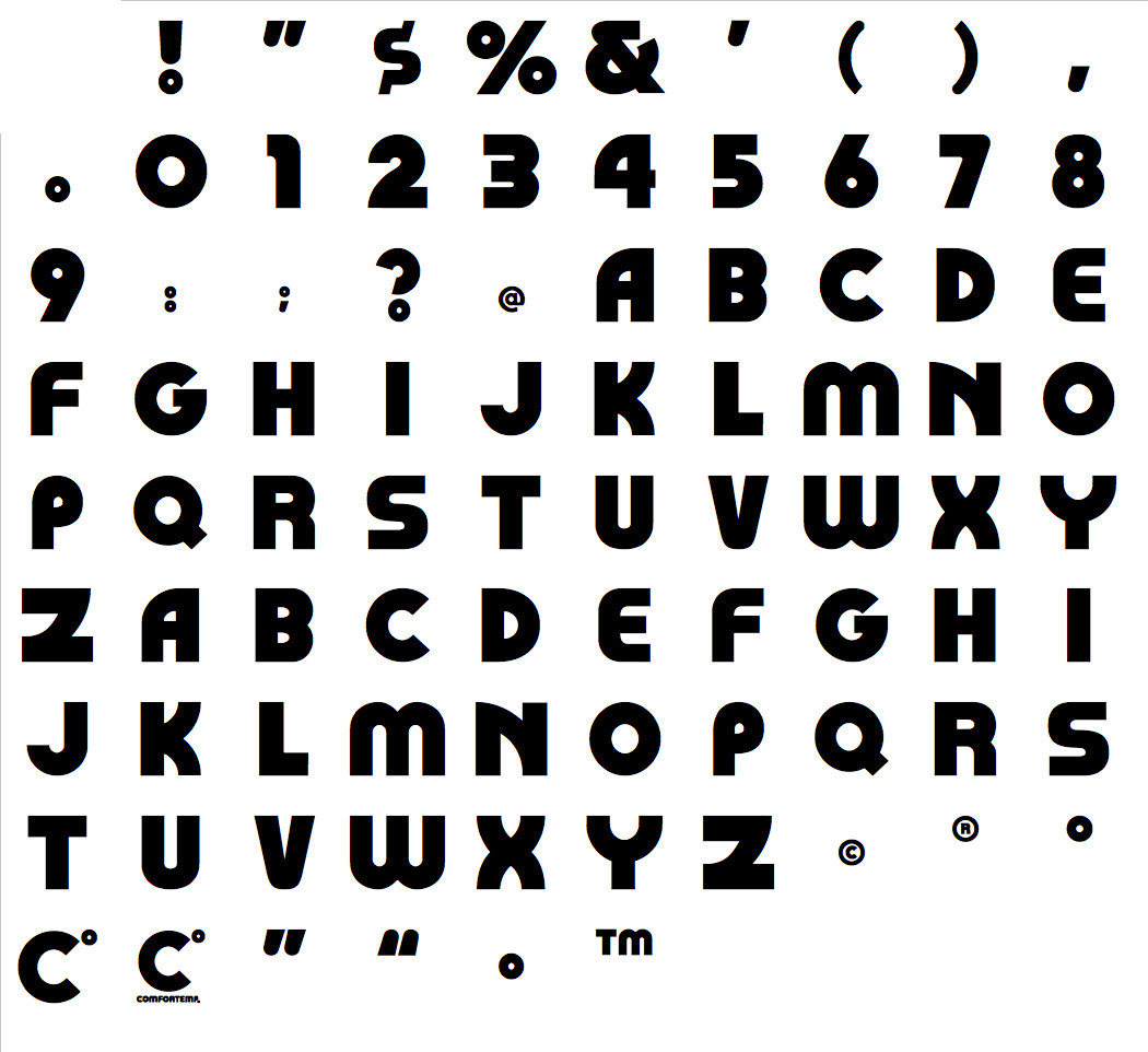
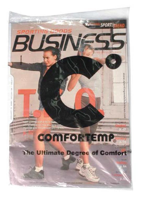
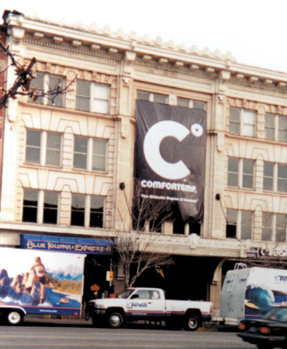


The strategy I created for Comfortemp positioned them as “The Ultimate Degree of Comfort". The logo is a play on the degree/celsius symbol. A simple idea executed in black and white making it easier and less expensive for clients to maintain their licensing requirements. The "degree" symbol also played a visual role in the advertising campaign. I even created a typeface to look completely different. In order to visually execute the creative strategy we needed to show the use in different performance markets - footwear, home, outdoor and hunting. We launched at a trade show where I wrapped the daily show magazines, inserted a swatch of the material in each magazine and even rented office space in the building across the street from the convention center to hang a banner. THE RESULT: The client was able to communicate the product benefits in multiple markets without changing messaging. They also received in influx of capital from investors once they got over that hurdle. CLIENT QUOTE: "John Harold thrives on executing a philosophy built upon the next right thing... no cookie cutters, no molds, no preconceived solutions. Where are you... where you need to be... elegant simplicity guides exceptional branding skills with global reach and capacity." – Duncan Russell / President & COO. Read the full story at: https://www.linkedin.com/pulse/rebranding-story-john-harold/?trackingId=cbI1ClhWSyGorYWJMqvuaA%3D%3D